Notice: Undefined variable: post_id in /data/wordpress/htdocs/wp-content/plugins/pressapps-knowledge-base/public/partials/page/page-single.php on line 41
Easy Accessibility -weekly tips

Article sections
Accessible materials are topical issue, both from the perspectives of renewed legislation and a diverse network of students and partners. Clearly structured and easily readable materials and websites are the best interests of everyone and at best they also serve as a marketing trump for new students or project partners. It is therefore good to include new routines through which new materials meet accessibility requirements immediately and do not require further modifications later.
Easy Accessibility -weekly tips refer to practical tips published in Yammer every other week. All 8 tips will be released during the spring, which will also be compiled into the Digipedagogical guidelines — come along!
Tip 1: Be you own document stylist!
The style of the document forms the basis of its accessibility. Using formatting styles, you ensure that people using the screen reader can navigate the material easily. When you use styles, the key substance of the document is easy to detect, but also change the style setting, you can edit all points that contain the same style with ease.
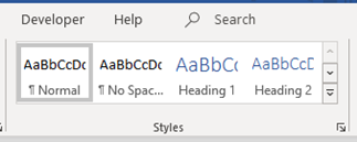
Heading styles are available in Word, which should be used hierarchical order, so that if you use Heading 1 at the main level of header, the Heading 2 used in the following subheadings and so on.

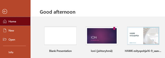
For PowerPoint presentations, there are Microsoft models that include layouts with the chosen style formatting concerning headings and subheadings. HAMK’s accessible models can be found at ContentCan.
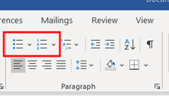
The consistent document style consists also of the use of lists with “bullet points” or numbers.
So, let’s check these document styles into shape during this week!
Tip 2: Fine with fonts – let’s check font types and sizes!
From an accessibility perspective, the intelligibility of content is influenced by the font style of text and its size. There are many options available and therefore accessible fonts are difficult to name. So, it is easier to learn how to identify the accessible font types and think about the size of the font according to the presentation or situation.
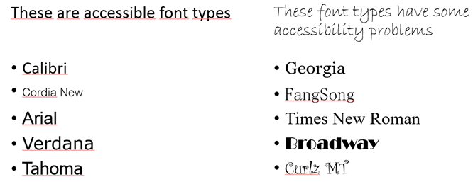
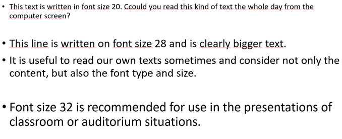
The accessible font is identified by straight lines (endless fonts), clearly distinctive lowercase and uppercase letters, and the lack of varying intricacies and thicknesses. Letters and numbers also have a distinct spacing to each other. The size of the letter also varies in different font types – all fonts in the image below are size 28.
It is advisable to use bold text to emphasize it, but italic text should be avoided, as well as coloured text OR CAPITALS.
Choose the font size depending on the status of use, since reading text from paper, screen or auditorium wall are quite the different stuff. For example, written Word-document on paper should be at least 11 or 12, in online presentations, like PowerPoint-presentations at least 20 and 32 for the text size of auditorium materials.
If you want to try a new perspective on your own materials, try the Web Disability Simulator, an add-on for Chrome browser. It allows you to simulate the impact of various visual impairments, difficulty in concentrating and in fine motor skills or excessive sunlight on viewing websites. The same simulator allows you to view your own PowerPoint presentations stored on OneDrive.
Tip 3: What is an “Alt-text”?
One picture can tell you more than a thousand words, is sometimes said. The images can illustrate and revitalize the content, but it is also lovely to have something else than only text on the page. Accessibility of pictures should be secured for people who use assistive technology or cannot see the image. Accessibility with images means that they have verbal information to describe the contents of the picture. That is often referred to as the “ALT text”, which is short for “alternative text”.
The alternative text can be added to the image either from the Picture Format tab, Alt text, or the Review tab, Check Accessibility.

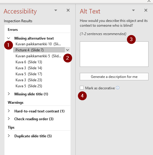
The accessibility checker shows all technical issues, which may have some accessibility problems in the document. “Missing alternative text” (1) -shows all the pictures which don’t have an alternative description. From arrow (2) opens a new column to write the alternative text (3) or mark the image as decorative (4).

Alternative text should describe the contents of the picture to the people who cannot see it. For this picture, the alternative text could be: “Girl runs on the beach and flies colorful kite”. The accessibility checker gives an opportunity to “generate a description for me”, which should be critically evaluated, although those descriptions are quite good in English.
Accessibility checker can be found both from Word and PowerPoint -software application. This checker also helps review the slides reading order in PowerPoint, but content logic and sentences should be analyzed by reading.
Let’s all check alternative texts during this week!
Tip 4: A good link works like a signpost
One characteristic feature of digital materials is that they can be accompanied by other documents, such as files and web pages, using hyperlinks. From the users’ perspective, it is essential to know what kind of material opens from behind the link or what type of object they end up with after clicking the link. The web-page address doesn’t tell these things, and therefore, the use of the web address as a link should be avoided.
From the accessibility point of view, considerations include:
- the link text, i.e., how the link is named,
- the destination of the link, i.e., what kind of material opens from the link,
- the visual differentiation of the link from the text, and
- the link’s functionality, i.e., whether it opens on the same or a separate tab.
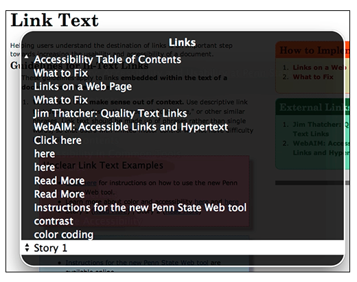
Good link text tells the user descriptively what can be found behind the link. “Read more” or “Additional materials can be found behind the link” are often poor link texts, as they do not provide any information about the contents of the link itself and do not help the user choose whether or not to open it. You can sometimes tell where a non-descriptively named link leads by context so that you can occasionally use them with good reason.
Usually, the link leads to an internet page, and therefore, it is also a good idea to add information to the link name if the material that opens is, for example, a PDF file. “Read more about HAMK research units” or “More accessibility information, pdf file” describe to the user both the contents of the link and the format of the material. It is also a good idea to indicate if the link leads to foreign language material.
Link naming is also important from the point of view of assisting technology, primarily screen reading programs. A screen reader is an application that reads the text displayed on the screen and helps the user navigate different text structures, such as heading levels. Besides, many screen-reading programs can extract all links on a page into a single list that display only link text. Links describing content are valid from the user’s point of view – so let’s prefer them!
If you’re more interested in screen readers, you can learn more about the topic by watching the Minnesota University video “Making Links Accessible” (opens in a new tab).
Placing links as part of the text also requires that you can easily detect them from the material. Links are most often distinguished from the text by an underline, and that is why underlining should not be used for other text highlighting. The link should also be detectable except by color alone.
Whether a link opens in the same browser window with the original material or a new tab is often experienced in different ways by users. Good practice with links is for in-site links to open in the same tab (except PDF or other attachments) and off-site links to a new tab. However, in terms of assisting technology, it is better if a link opens in the same browser window with the original material. This is also set as default in most programs, such as WordPress, for example.
Let’s remember that a good link is a tip for content!
Tip 5: Should I make a table?
A table is a suitable format for summarizing large amounts of data or compare contents side-by-side. For these purposes, it also serves the reader by structuring the content into a sharp mode. Sometimes you can also see that tables are used to parse different structures on a page or as a visual layout tool, for which purposes the tables should not be used.
From an accessibility point of view, tables can be challenging for the readers, especially if they use assistive technology. Large tables often scale poorly on small screens, and it can be hard to read the contents, for example, with screen reader programs. Therefore, the first thing to promote accessible content design is to ask yourself, “Do I need a table right here?”
Sometimes, however, the table is a proper way to share content and, if done correctly, it is also accessible presenting. A good checklist for the table author includes 5 points:
- Use the software’s tool to make a table — don’t share it as a picture.
- Design the table so that all its columns can be seen at once.
- Name the table properly by content.
- Type a descriptive title for each column.
- Avoid split, merged, nested, or empty cells (except sometimes A1 cell).
Tables shared in web pages, both the title and column and row labels must be added to the code. Then the screen reading programs pick all content up there. Screen readers can best read Html-formatted tables.
Look at the table below and think about what you would do differently when the goal is to make the table as accessible as possible. The proposals for correction can be found below the picture.

- The column heading does not describe the content, and the idea of the ‘yes/no’ column, in particular, remains unclear.
- Empty cells in a table should be expressed in other ways, such as, e.g., 0, a line or other character that is understandable to the content.
- The e-mail address should be plain text, not a link. When a screen reader lists links to a page, you don’t want email addresses to be included in the search results.
- The table should not contain merged cells.
- The contents of the table must be correct and in relation to each other.
Tip 6: Check the contrasts!
Many of us write hundreds of words of text every day. However, only a few people may think that a message depends not only on word selections, text size, and fonts but also on the font color and differentiation of the text and the background. In most cases, attention is paid only when the color difference between the text and the background, i.e., the contrast, is not sufficient, and the writing is impossible to read.
Accessibility guidelines advise you to use colors carefully so that color is not the only way to express essential information in the text. The same concerns the website selection buttons or visual elements. It is also a good idea to remember this when commenting on a colleague’s text or writing feedback to the student. So, think again if you were writing the sentence “The text I marked in green is perfect, but that paragraph (I marked in red) you should reshape. Such mystical color coding should be forgotten!
However, compliance with accessibility criteria does not mean giving up colors, but their selection and use should be deliberate. Contrast is indicated by a series of numbers that are difficult for the basic users to understand. Celia’s saavutettavasti.fi website has a good example of text contrasts and their presentation in numbers:

You can use contrast checkers which are available for free on the web to check your own documents’ color contrasts.
- In WebAIM Contrast Checker, you can enter the text and background colors yourself in RGB numbers, after which the reviewer will provide information about the contrast both as a number and the passing of AA or AAA level accessibility criteria.
- ContrastRatio illustrates the effect of changing background color. By typing a different color instead of the word “White,” the background color of the text also changes.
In addition to the color of the text, the contrast should also be considered for the background color. The accessible text is quite easy to obtain non-accessible by changing the background color, as shown in the figure below.

If the text is part of visual logo or brand text, then these contrast requirements are specified. At its best, colors bring variety and clarity to materials when their use is considered. So let’s make sure, that the contrasts are checked!
Tip 7: Fluent Finnish or Excellent English
Reading text from your computer screen may seem obvious, but it’s not for everyone. Various eye diseases, visual impairments or learning difficulties can make it impossible or exhausting to read text from the screen. That’s why it’s good to know that computers can speak both Finnish and English fluently.
There are several options for converting text to speech: features integrated with applications, a feature associated with the operating system, or separate screen reader programs. They differ at least in terms of the scope of use and the versatility of the functions, but also the ease of use.
If you suppose your computer is able to speak Finnish, you must install the “suomi-puhepaketti” from SoftwareCenter and download it, and set the right settings on.
The most commonly known reading program integrated with applications is the Microsoft Immersive Reader, which allows you to read text aloud in e-mail, office programs, and the Edge browser. In Outlook, the function can be found under the name “Read aloud” after the message is opened in a new window. In office programs, functionality can be found in both the desktop and browser versions behind the “Immersive Reader” button, on the View tab in Word, and in OneNote on the Learning Tools tab.

Edge browser has two different audio reading features: a simple version that is quickly deployed, and a more versatile option with more easy-read settings. You can start listening to any webpage when you press the right mouse button while the webpage is open and select “Read aloud”. The mouse clicking point on the page also determines where the reader starts reading. The same action also starts with Ctrl+ Shift + U, which starts reading right at the top of the page, including the menus. A more versatile option can be found in the browser’s address bar in the “Open Immersive Reader” button (1), which opens the actual reader menu (2). In the Edge browser, you can also read documents stored in PDF format aloud.

The Windows operating system also includes integrated reader features, one of which is Narrator, a screen reader that, as its name suggests, reads aloud texts on your computer screen. It can be controlled either by a keyboard or by a mouse. To use Narrator, you must enable it in Windows Settings: Settings – Ease of Access – Narrator. In the future, you can open and close Narrator by pressing Windows + Ctrl + Enter.
On different operating systems, screen readers have different names, such as VoiceOver (Apple), TalkBack (Google), and Orca (Linux). Take also a look at other programs that support learning as well. Managing screen reader programs is a little more challenging than using integrated reading features, so it’s a good idea to reserve a moment of time and patience to study them. Screen read programs are also available as independent programs, such as NVDA (Windows), ReadSpeaker and Jaws for a fee.
Let’s try how smoothly your computer can talk!
Tip 8: Save your fingers, speak the content into text!
Does writing sometimes feel laborious? Would it be easier to formulate your thoughts by talking? Many office programs or other applications currently have an integrated function that automatically formulates speech into text.
In Microsoft Office programs, such as Word, PowerPoint, and OneNote, such a feature can be found under the Dictation/Sanelu on the Home tab. From the icon’s drop-down menu (hack), you can verify the correct language, that is, the language you speak.

First, click on the document where you want to produce the text. While dictation is activated by pressing a button, a red circle appears, indicating listening. You will also hear a short sound when the dictation is activated.
Dictation listens to your speech and writes it as text. It is therefore worth paying attention to clear articulation and a calm pace of speech. When you take a long break, the dictation automatically places a point in it. The comma function is also able to put in grammatically simple places. You can also dictate commas and dots to a text, making them places you want them to be.
Dictation is active until you press dictation again. For example, you can switch from the title bar of a PowerPoint slide to a text section or a completely different slide without interrupting the dictation in between.
The best way to dictate is to use a headphone microphone combination or some other high-quality microphone because at least the laptop’s microphone can’t separate the dictation accurately enough. Therefore some errors can occur, or whole words may be missing.
Here’s how it works in practice: watch a short video review of how to use dictation (Video language is Finnish, English captions available).

Notice: Undefined variable: output in /data/wordpress/htdocs/wp-content/plugins/pressapps-knowledge-base/public/partials/page/page-single.php on line 83
